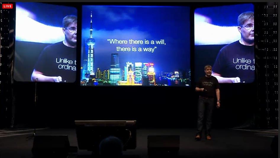
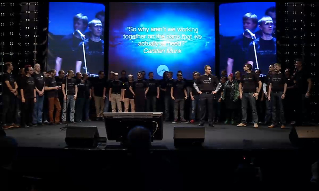
 | At the ongoing Slush event in Finland, mobile startups Jolla have finally showed to the world the latest mobile operating system: Sailfish OS. As many will know, Jolla’s staff comprises mainly ex-Nokia employees working on |
At the ongoing Slush event in Finland, mobile startups Jolla have finally showed to the world the latest mobile operating system: Sailfish OS. As many will know, Jolla’s staff comprises mainly ex-Nokia employees working on the now-defunct MeeGo development team, and are joined by community developers the world over. Sailfish OS is born from the ashes of MeeGo-Harmattan as well as community projects such as Mer and Nemo. While the keynote speech details plenty of corporate news, Jolla also announced that Finnish operator DNA will be the first telco to sell Jolla-branded smartphones, where the first device is expected to retail sometime in 2013. But of course, the keynote speech was eagerly anticipated simply for one reason: Sailfish OS and a brief demo of Jolla UI.
Read on after the break for more, as well as a short demo video.
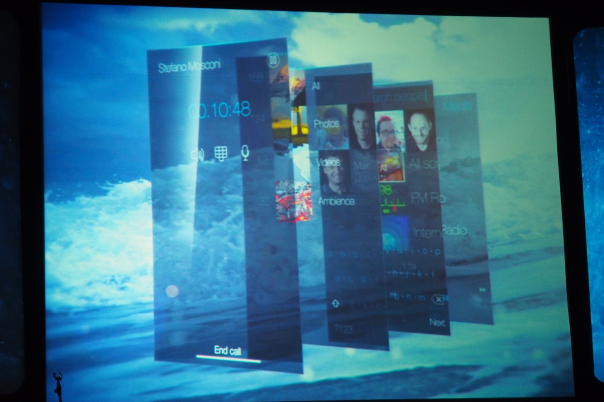
Jolla UI builds on MeeGo-Harmattan’s Swipe UI by Nokia. From what they’ve displayed so far, there are no homescreens – at least, traditionally. While most mobile OSes feature side-scrolling between homescreens, Jolla UI sports a seamless vertical scrolling user experience, where even the lockscreen is incorporated. Unlocking a smartphone on Sailfish OS is similar to Nokia’s N9, starting with a double tap to wake the phone. Then, a swipe up will bring users to the home screen. Here, MeeGo-Harmattan’s Active Application home screen is evolved in Jolla UI. If there are no applications running, this home screen will be empty. Opening an app will create a tile similar to MeeGo-Harmattan’s Active Applications. However, unlike in MeeGo-Harmattan, swipe gestures are incorporated on these tiles, where a swipe to the left or right on a tile will initiate different actions. Users can now interact with multiple active applications without even going into the applications. At the bottom of this home screen there are four quick launch icons that seem to be taken from Android. Swipe up from this home screen and you’ll find the app drawer. Swipe down from the app drawer and you’ll be back at the home screen. Swipe down again, and you’re at the lock screen, which will lock the phone after several seconds. Again, just like in MeeGo-Harmattan, horizontal swipes when in any application will take you back to the home screen, where users can find an active tile of the application there. Remember, Sailfish OS has real multitasking, so all applications are concurrently running just like in a desktop environment. However, one thing is very obvious from the very quick demo we’ve just witnessed at the keynote presentation. While the UI is pretty fluid, and presents a fresh user experience that enhances the intuitiveness of MeeGo-Harmattan, there is a very real lack of applications. Of course, the OS isn’t even out yet, but we’re very curious just how interested developers from other platforms are in Sailfish OS. Responses from Jolla are naturally very positive, but time will tell. Another interesting aspect that was witnessed was in the Jolla UI presentation video embedded at the top of the article. At around 0:50, there is a very brief – but unmistakable – image of Google’s Android logo. A quick check at sailfishos.org (a Wiki site for developers and advanced users for more technical details on the operating system) will show that Sailfish OS “many Android applications will run on Jolla devices unchanged”, which will suggest that there is support for Android apps to run natively on Sailfish OS – fantastic news that will alleviate the potential lack of applications (BlackBerry also has some form of Android compatibility layer for BB10). However, applications can be ported to Sailfish OS to fully utilise Jolla UI and other features of Sailfish OS. From what we have seen so far, it does look like the Swipe UI on Nokia’s N9 is more intuitive than Jolla UI. Of course, this is just based on first impressions of a very short demo. Regardless, Jolla will hold an extended demo of its Jolla UI later this evening, and we will update this post (or write a new one) to detail Jolla UI’s other features. Link : Introducing Sailfish OS by Jolla: MeeGo is Definitely Not Dead | |
Technology News and Product Reviews: Your premier source for technology news and unbiased expert product reviews of HDTVs, laptops, smartphones and more | |
Subscribe to:
Post Comments
(
Atom
)


0 Comments:
Post a Comment